Designing an Effective Moodle Course
How can you use Moodle to best organize and present your course content to help you achieve your instructional goals? Learn best practices, including resources and examples to boost engagement and accessibility.
In this article
- Create a plan
- Decide on your organization
- Review best practices
- Explore examples
- Workshop information
- Resources
Create a plan
Having a plan for your course is a good idea before you start building it in Moodle. You might have an outline that is very detailed or a course map. A course map can be very helpful in planning the structure of your course before you start to organize it in Moodle. Mapping out your course components helps ensure alignment between your learning objectives and the instructional materials, activities and assessments in your course.
A course map includes
- Course learning objectives, which state what students will be able to do by the end of the course
- Module or unit learning objectives, which state what students will be able to do by the end of this module, unit or lesson and scaffold students toward the achievement of the course learning objectives
- Instructional materials and learning activities, which are items you select or design to help students get the information and build the knowledge they need to achieve the learning objectives
- Assessments, which allow you to measure students’ achievement of the learning objectives?
Course mapping resources
- Make a copy of the Course Map Template
- Complete the course mapping tutorial
- Watch the course map workshop recording (runtime 28:57).
Decide on your organization / layout
Moodle courses have course sections and sub-sections that are helpful for moving your course design from outline or map to Moodle. Will you have a separate section for each week? For each topic? Determine how you will divide up your course into logical sections before you begin building it in Moodle.
Review the basics of editing in Moodle
Need some instruction or a refresher on editing your Moodle course? Teaching with Moodle is a self-paced asynchronous course that is a great way to learn more. Module 2 (Getting Started Navigating Moodle) and Module 3 (Getting Started Adding Content and Activities) are a good place to start.
Review best practices
1. Use a consistent structure for each course section

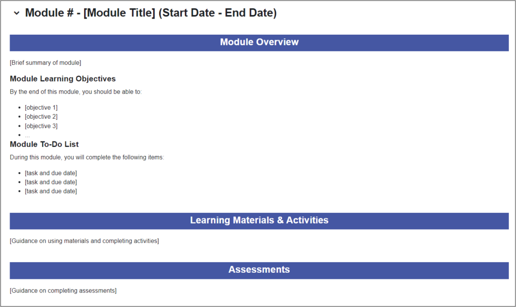
Name course sections with concise, descriptive names and include dates in the names, for example, “Unit 1: Topic (Dates)”
- Use Text and media areas to separate and preface / describe groups of items. Be consistent from section to section.
- Start each resource or activity name with an action verb that lets students know how they are expected to interact with it. For example, “Submit your essay”
- Consider indenting items to make their hierarchy and relationship clear.
Consider using the Quick Start Course Shell
The Quick Start Course Shell provides a framework for organizing your content in Moodle. See the Quick Start Course Shell User Guide for more information and guidance.
2. Organize content into logical, digestible pieces
Walls of text and visual can be overwhelming. Using subsections and moving content into a Moodle Page resource can help. Be sure to use heading styles to break up content, and bulleted / numbered list items as appropriate.
3. Make important information easy to find
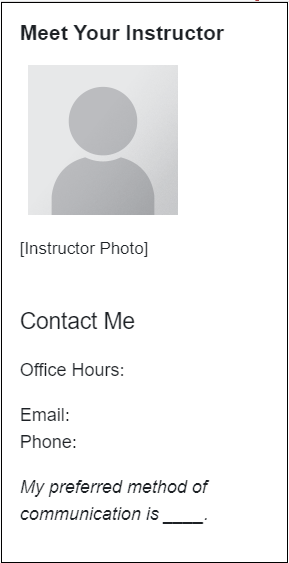
Blocks to the right side of your course can highlight important information and links. Some blocks you might consider using are the Activities block, which provides easy access to assignments and other course activities, and the Managed Content Bock > Student Services block which provides links to NC State services for students. Create a text block for your instructor information (see screenshot below) or as a place to provide links to course resources like the syllabus or schedule.

4. Ensure accessibility
Use our Digital Accessibility Guide to learn about common accessible practices like
- Providing alt-text or descriptions for all images.
- Using properly nested heading styles in document and text editors.
- Using descriptive link names instead of the full URL.
- Providing captions and/or transcripts for audio and video content.
Run the Brickfield Accessibility+ Toolkit to find and fix common accessibility errors.
5. Design for student engagement
Design for engagement in your Moodle course by creating quality interactions between students and the course interface, the instructor, other students and the course content. Explore NC State’s enterprise instructional tools for ideas, and consider the examples listed below.
- Interact regularly with your students by sending regular Announcements, attending to questions posted in a help forums, and giving timely feedback.
- Provide opportunities for student-to-student interaction through Yellowdig, Perusall and Moodle forum activities.
- Use Moodle groups to facilitate both student-to-student interaction and active learning.
- Ensure rich student-content interaction by using active learning tools like H5P, PlayPosit and Moodle Quiz.
Explore examples
What does a well-organized Moodle course look like? Take a look at these examples of real NC State courses to see how they effectively organize content and make it easy for students to find information.
Workshop information
Moodle Basics: Organizing Your Course (part of Teaching with Technology Bootcamp at the start of each term)
Resources
Tips for Organizing Your Moodle Course: Strategies for organizing Moodle course
Videos
Strategies for improving interactions and increasing student engagement in your online course:
Examples, Templates and Guides
Accessibility
- Digital Accessibility Guide
- Brickfield Accessibility+ Toolkit – DELTA’s YouTube Playlist
- Accessibility Quick Guide: High-level understanding of how to use different types of campus technologies accessibly
- Quick Course Content Checklist: Accessibility concepts and guidance for using campus technologies accessibly
- Video captioning grant: Faculty may apply at any time