Make Your Course More Mobile-Friendly
With more students using smartphones and tablets to access their courses through the NC State Moodle mobile app, it's crucial to design your content with mobile learners in mind. In this article, we will establish a framework for optimizing your course for mobile devices, providing a better user experience, increasing engagement, and helping your learners succeed.
In this article
Understanding Mobile Learners
Mobile optimization goes beyond merely adapting course content to fit smaller screens. It involves designing courses with the unique needs and behaviors of mobile learners in mind. Mobile learners prefer to consume information in clearly communicated bite-sized chunks. They also value easy navigation and the ability to quickly access important course materials and information such as grades and assignment due dates. By optimizing your Moodle course for mobile delivery, you enable learners to easily remain connected to the course. The more learners engage with the course content, the more likely they are to be satisfied with their course experience and succeed.
Tips for Mobile-Friendly Course Design
Organize Content Into Chunks
- Break down course content into bite-sized modules or lessons that can be consumed in short intervals.
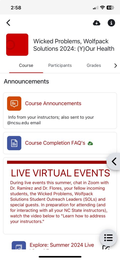
- Use the Custom Sections or Weekly course format in Moodle for the best mobile experience. In custom sections format, the first section or the highlighted section is shown by default in the app. In weekly format, the current week is shown.
- Break up long videos into shorter segments and state the video duration so that learners can appropriately plan their viewing time when they are on the go.
Keep Text Simple, Clear and Focused
- Make effective use of separation and white space.
- Structure content using clear, consistent headings and brief paragraphs.
- Minimize large blocks of text. Prioritize key information and use bullet points or numbered lists to improve readability.
- Use clear language, avoiding complex sentences and jargon where possible.
- Use concise and descriptive link text rather than pasting entire URLs.
- Tables can be difficult to view on mobile devices. If you must use tables, make sure they are formatted for mobile screens or consider alternative ways to present the information.
Provide Accessible Multimedia
- Provide alternative text or long descriptions for images.
- Make sure images resize properly on smaller screens.
- Minimize use of decorative images that don’t directly support learning; they take up valuable space on small screens.
- Use Panopto or YouTube for videos, never upload video files directly to Moodle. Moodle is not intended for video streaming; system-wide breakdowns can occur if multiple learners are watching videos uploaded directly to Moodle.
- Provide accurate captions or transcripts for videos. Consider that learners who aren’t hearing impaired may need to mute the sound on their devices depending on their location.
Streamline Navigation
- Avoid cluttered layouts.
- Consider how you use blocks. Unlike the web version, the block drawer in the app is closed by default when a learner opens the course. Be aware that learners may have to scroll a lot to view block drawer content, so try to keep text concise.
- Be careful using stealth activities or direct links to activities. While the links will still work, it may not the best experience on mobile.
- Make sure titles and names are descriptive and concise for easy navigation using the course index.
- The names of Text and Media Areas (formerly Labels) appear in the course index by default. Make sure to update the name of each Text and Media Area or use the toggle button in the settings to hide decorative items from the course index.
Additional Tips
- Set up your gradebook properly before the start of the semester. One of the main things students want to do in the mobile app is check their grades.
- Test on your own device. Download the NC Moodle State app to preview how your course looks and functions on mobile.
- Become familiar with notifications that can be pushed from the app, and advise students about which notifications you recommend they have turned on.
- You can require students to access (or NOT access) a resource or activity using the Mobile app using the Restrict access > Mobile app setting.
- Some interactive tools may function differently or not at all in the NC State Moodle mobile app. Provide mobile-specific instructions or an alternative format if necessary.
- Remind students that while the mobile app is a convenient tool, they will still need to access the web-based Moodle course for full functionality.
Resources
References
Baldwin, S.J., Ching, YH. Guidelines for Designing Online Courses for Mobile Devices. TechTrends 64, 413–422 (2020). https://doi.org/10.1007/s11528-019-00463-6
Creating mobile-friendly courses – MoodleDocs. (n.d.). Docs.moodle.org. Retrieved June 28, 2024, from https://docs.moodle.org/403/en/Creating_mobile-friendly_courses
Johnson, R. (2023, August 3). Designing Mobile-Friendly eLearning: Optimizing Learning For The Mobile Era. ELearning Industry. https://elearningindustry.com/designing-mobile-friendly-elearning-optimizing-learning-for-the-mobile-era
Pappas, C. (2017, January 2). 8 Tips For Developing Mobile-Friendly eLearning Courses. ELearning Industry. https://elearningindustry.com/tips-developing-mobile-friendly-elearning-courses
Shaw, A. (2017, May 10). Designing Online Courses for Mobile Optimization. Center for Teaching and Learning, Risepoint. https://ctl.risepoint.com/designing-online-courses-for-mobile-optimization/