Using Intelliboard Data to Improve Student Success
Intelliboard is a powerful data visualization tool that gives you user-friendly reports about Moodle data. Intelliboard takes information about your online courses from Moodle and helps you get the most usable data about your students and their progress in your course.
In this article
Intelliboard Dashboard
The Intelliboard Dashboard provides a snapshot of your courses. The default is set to show you data from the last week. You can change the time frame to meet your needs, but you will need to make this adjustment every time you want to review different information. Here’s how to utilize the dashboard to increase student success and class improvements:
Weekly Statistics to Review:

- Overview: Course Overview by Activity – Displays in a graph the amount of time spent on each activity in the selected course. You can hover over the chart and it will give you a description of the activity and the total time spent. If you see that some activity isn’t being utilized, you can use this to drive future course revisions.
- Overview: Course Overview by Topic – Displays a bar graph of the amount of time spent on each topic or module for the course. You can compare this to other measures, like average score for the module quiz, to see the impact of time spent.
- Overview: Activity Progress – Displays the percentage of activity completions for the course. If you see that many students have yet to complete the activity for the week, you could send an announcement to remind students of the due date and encourage them to ask you questions.
- Total Students – This shows the number of students during the time frame selected. The red section is inactive students and the blue section is active students. You can use this information to reach out to students who were inactive.
Mid-Semester Statistics to Review:
- Student Grade Progression – This graph shows the average grade for the course compared to an individual student’s grade. This might be useful if you have a small class and want to do an intervention for at-risk students. Remember to set the time frame from the beginning of the semester to the current week.
End of Course Statistics to Review:
At the end of the semester use the following dashboard statistics to revise course content. Remember to set the time frame for the beginning of the semester to the last day of the semester to get accurate information.
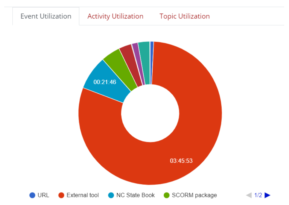
- Event Utilization – This graph shows the breakdown of total time spent on different types of resources and activities in your class. Use this graph to get an idea of what resources students are utilizing and what types of content you are creating for your course. You can use this information to drive diversification of your content or to learn what content students are spending the most time on and how you can leverage that in future courses.
- Activity Utilization – This graph gives you a breakdown of time spent on activities in your course. If you are interested in seeing utilization for the time frame when students would typically be utilizing a specific activity, make sure to adjust the time frame at the top.
- Topic Utilization – This graph provides time spent on each topic or module in the course.
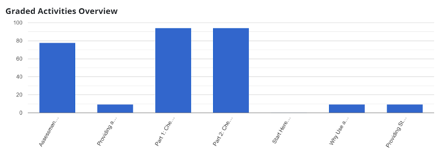
- Graded Activities Overview – This section gives a graphic representation of the average grade for each activity in the course (during the selected time frame). You can use this graph to see if there are any trends in grades and compare this to the time spent on topics.You can use this data to provide students the following semester with guidelines for how much time they should be spending on each activity to be successful in the course.
Intelliboard Reports
Intelliboard Reports provide a complete picture of your courses and your students’ statistics. There are a variety of reports that can give you empowering information about your class content and student performance. When trying to decide which report to run, ask yourself the following questions:
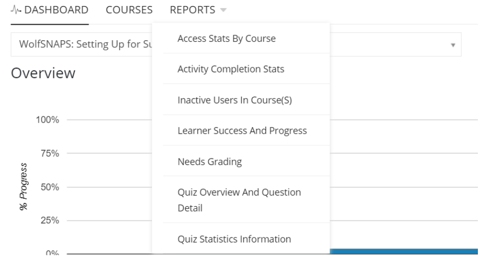
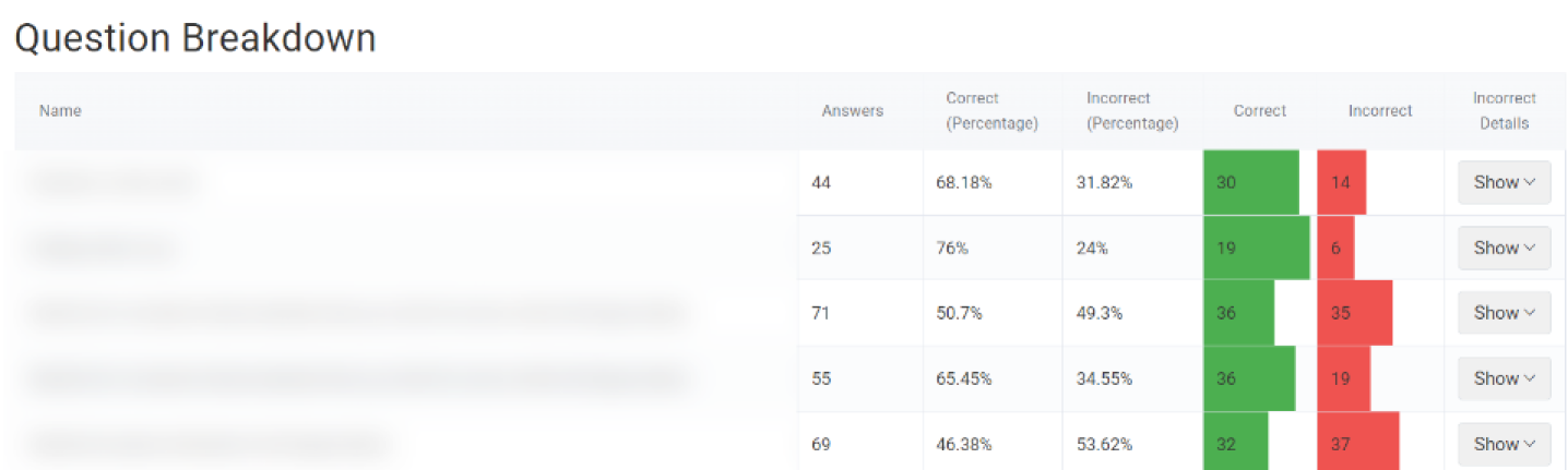
- Are you interested in quiz questions that learners struggled with answering? The Quiz Overview and Question Detail report provides a question breakdown. After reviewing this report, you can investigate why learners missed the question and make adjustments to the quiz or the course content as needed.
- Do you allow multiple attempts for quizzes and would like to review student progress? The Quiz Statistics Information report provides statistics about grades and attempts and tells you about learner success and progress.

- Do you have assignments to grade in multiple classes? Consider using the Needs Grading report. This report will give you a list of assignments that need grading and you can click on the assignment and it will take you directly there to start grading.
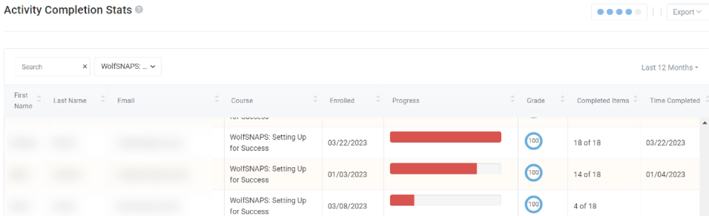
- Do you have Activity Completion tracking enabled and would like to see learner progress? You can run the Activity Completion Stats report to see how students are progressing based on the activities they have completed.
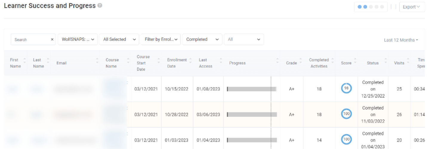
- Do you want to look at activities, grades, and time spent in one report to identify at-risk students? The Learner Success & Progress report is sortable and provides you with important data about student success and gives you a list of students who are struggling or failing your course. With data about activity completion, grades, and the amount of time each student is spending, you can share with each student their data and how that compares to other students.
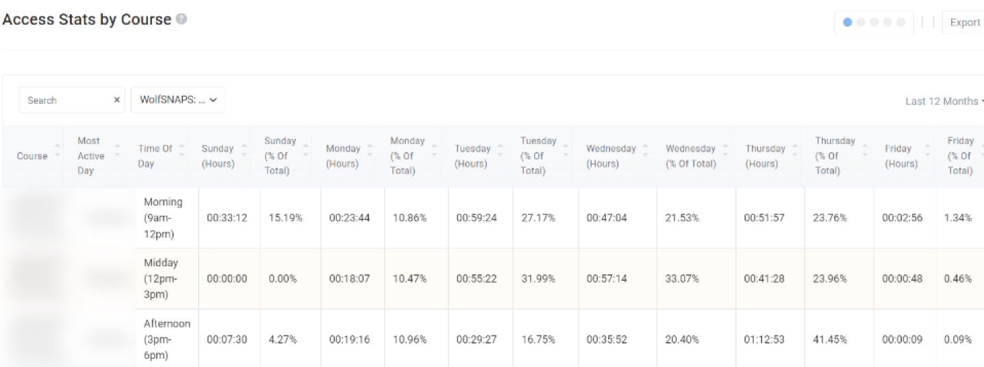
- Are you interested in figuring out when most students are accessing class content? You can run the Access Stats By Course report to see when students are usually accessing materials in your online course. You can use this data to schedule online office hours, post announcements, or interact with students so they receive timely information when they usually are in your course.
- Do you want to reach out to inactive students? The Inactive Users in Course(s) report lists learners who haven’t accessed your course in a set amount of time. You can choose a specific timeframe, such as a week, two weeks, or a month and get a list of learners that are disengaged.

Workshop Information
Utilizing Data From Intelliboard to Improve Student Success
If there are no available workshops to register for, please feel free to request an instructional consultation from LearnTech about this topic.
Resources
Overview of Intelliboard (DELTA Knowledge Base article)