Tips for Organizing Your Moodle Course
A cluttered and confusing Moodle course can lead to cognitive overload and frustration for students. This article will discuss how to organize the layout of your Moodle course to make it easy for students to locate information quickly so that they can focus their mental energy on learning.
In this article
- Begin with the Quick Start Course Shell
- Make the course navigation clear
- Reduce visual clutter
- Make information readily available
- Workshop Information
- Resources
Begin with the Quick Start Course Shell
You may have heard that if you want to organize a closet, it’s a good idea to take everything out and start with a nice clean space. The same can be true for organizing a Moodle course. The Moodle Quick Start Course Shell (QSCS) provides a fully customizable basic framework that includes consistent structure and placeholders for organizing content in each section. It’s a great way to visualize how you can organize your course if you don’t know where to start.
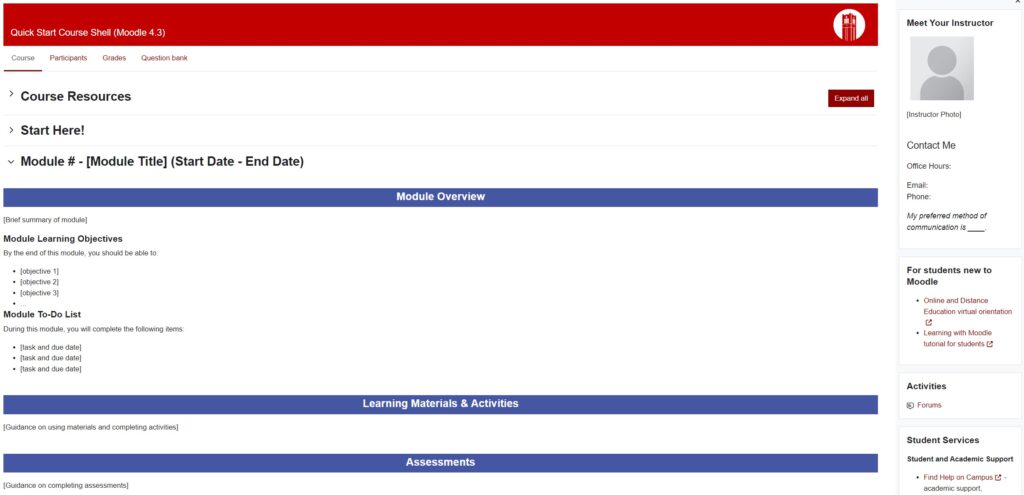
- Watch a video walkthrough of the Quick Start Course Shell
- Read the Quick Start Course Shell User Guide for more information about the shell, and instructions for using it.
Make the course navigation clear
Include a “Start Here!” section at the beginning
Your students may be taking 4 or 5 courses, all with different Moodle set-ups. Going into a new course for the first time can be disorienting.
Provide a “Start Here!” section at the very beginning of the course that includes important information for getting started successfully in the course. Watch a demonstration of a Start Here section (beginning at 4:02). Consider including the following information in your Start Here section:
- Instructor welcome letter and/or video
- Course overview page
- Video walkthrough of the Moodle course
- Links to course documents (course overview, course map, course schedule, etc.)
- Activities such as an Introduce Yourself forum.
Use short, descriptive titles for course sections
Concise, descriptive titles make it easy for students to navigate to sections on the using the Course Index in Moodle. Including dates in titles help students locate current content. In the Quick Start Course Shell (see screenshot above), we recommend the following format: “Unit # – [Unit title] (Start Date – End Date).
Group items under consistent headings
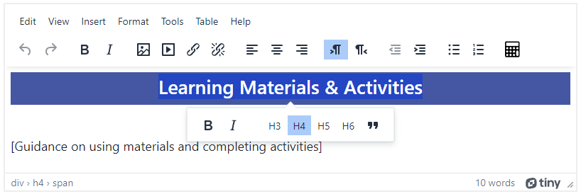
The Text and Media Area resource in Moodle can help to separate long lists of items into “chunks” so that learners are able to quickly scan and locate groups of items easily. In the Quick Start Course Shell example above, Text and Media Areas are shown separating the Overview from Learning Materials and Activities and Assessments.
When creating a Text and Media Area resource that is intended to serve as a heading, be sure to use heading styles found in the Moodle editor to ensure the heading is accessible to assistive technologies such as screen readers.
Use descriptive names for resources and activities.
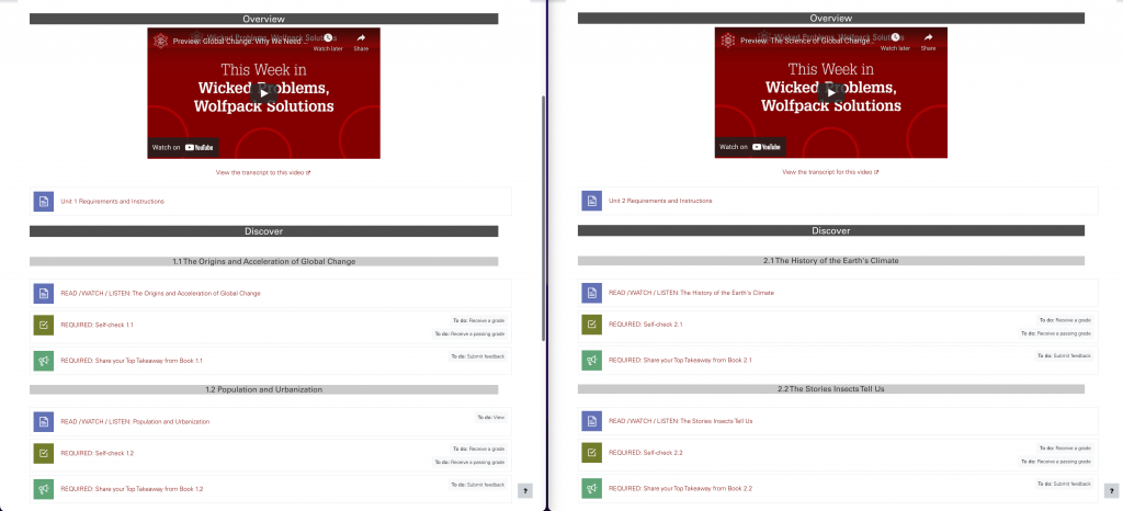
Descriptive and consistent names provide clarity to students about what that item is and how they are expected to interact with it.
- Use an all caps action verb as the first work in the name (e.g. WATCH this video on…) to indicate to students what they are expected to do with that item.
- Use consistent naming throughout seections so that students don’t have to spend time deciphering varied descriptions.
- Use the name of the resource a URL points to as linked text, rather than writing out the URL to be displayed as the linked text.
- Make sure file names are unique and descriptive of the content.
Provide a brief overview of each section so students know what to expect.
Providing context at the start of each section can help learners be more prepared and focused. This information is also helpful for students to reference as they progress through the content. Consider including the following introductory information at the beginning of each section:
- What: Provide a brief overview to let students know what to expect in this section.
- Why: List the learning objectives so that students understand the purpose of the resources, activities and assessments.
- How: Provide a task list so that students understand how they should progress through the content.
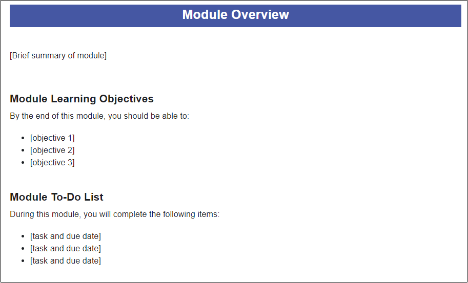
Use a consistent structure throughout all sections in the course.
Consistency of structure from section to section throughout the course helps to lower extraneous cognitive load. When students don’t have to spend mental energy on navigating an unfamiliar structure in each section, they can focus more on learning. While the number of resources and activities may vary, the overall structure and grouping of items and how they are labeled should be consistent between sections throughout the course.
Reduce visual clutter
A clean, organized interface is less overwhelming for students than one that has a lot of clutter. This is particularly helpful for neurodivergent students who may be challenged to know what to focus on when confronted with a lot of information. Read more information about this topic in the article Supporting Neurodiverse Students Through Course Design.
Consider the length of descriptions on the main page
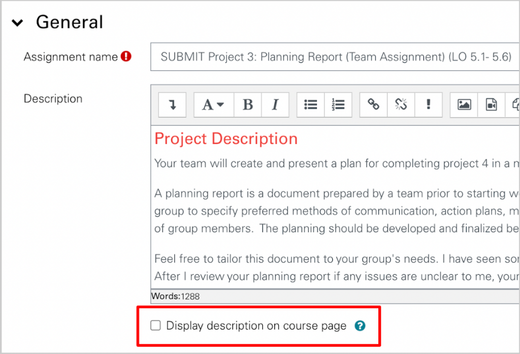
Providing detailed descriptions of activities and assignments is critical for student success. However, large blocks of text can add to visual clutter and increased cognitive load when a student is trying to locate other content in a section. If the description for an activity takes up more than a couple of lines, you may want to leave the “Display description on course page” box unchecked.
Put multiple files into a folder
If you want to make multiple files available for students to download, you can use the Folder resource in Moodle to group them together and conserve space on the main course page. Files within a folder may be downloaded all at once by students. Putting files into a folder that has a descriptive title reduces the number of items on the main course page.
Move multiple links into a page
Multiple links, if added as individual URL resources, can take up a lot of space on the main course page. You might group these links together by moving them all to one Page resource in Moodle.
Use “stealth activities”
Stealth activities in Moodle are available but not shown to students on the main course page. This means that students can access the activities through links you provide in another locations. An example of using this feature is to link to a quiz within a page instead of making the quiz a separate activity displayed before or after the page. One caveat – if you provide a link to a stealth activity, the completion requirements and date due will not be visible on the main course page.
Make information readily available
The Block Drawer (video, 2:32) on the right side of the Moodle screen can be expanded to show useful information and course management tools. Use Blocks to help students quickly find information and navigate to course resources and activities.
| Block Type | Function |
|---|---|
| Text | Displays custom text, links and images |
| Activities | Allows students to view a list of all activities in the course of a given type |
| Student Services | Contains updated links for academics, technology, and student support services (maintained by DELTA) |
| Calendar | Displays indicators and links to course items that have dates associated with them |
| Upcoming Events | Links to activities with upcoming due dates |
| DELTA Testing Services | Links to the website where students can schedule their testing appointments |
Workshop Information
Moodle Basics: Organization
If there are no available workshops to register for, please feel free to request an instructional consultation from LearnTech about this topic.
Resources
- View the Moodle Organization workshop slides
- Read the Quick Start Course Shell User Guide
- Read Supporting Neurodiverse Students Through Course Design
- Read Streamline Your Course Page (Moodle document)