Digital Accessibility Guide
This guide will help you make content in your course more accessible and improve readability and usability through good organization and navigation principles.
In this article
Introduction
Course accessibility in digital spaces is crucial for students. Making digital course content more accessible means ensuring content, interaction, communication and full engagement are equally available to all learners regardless of disability status. In this guide, we approach accessibility from a Universal Design for Learning (UDL) perspective. The UDL framework cautions that when we offer one and only one way to interact with, access or engage with course material, we are likely excluding some members of our broad learner community. Thus, for the purposes of this guides, we broadly define accessibility as including
- Accessibility – Enabling full access to the learning experience regardless of disability status
- Usability – Providing an effective, efficient learner experience
- Flexibility – Appreciating and considering all forms of human variability in course design
Principles for making your course accessible can be remembered using the acronym POUR. Your course and its content should be fully:
- P = Perceivable
- O = Operable
- U = Understandable
- R = Robust
Most of this guide pertains to perceivability, operability, and understandability. When you consider whether your course is robust, you are ensuring that content and tools are compatible across platforms and assistive devices. Be sure to include a link to the accessibility information for each tool in your course policies or with descriptions of tools on your course site, perhaps linking to this list of the accessibility information for all enterprise technologies at NC State. It is important to learn about the accessibility limitations of any tools that you are using. You can check with the Office of Information Technology or learntech@ncsu.edu for help.
You might use this in conjunction with DELTA’s Online Course Usability and Accessibility Checklist, which can help you identify which areas need attention.
Available accessibility checkers
Accessibility checkers are powerful tools that can identify accessibility problems in your content and sometimes also help with solutions. One smart, proactive strategy is to run these checkers on each piece of content as well as on your Moodle site to check for accessibility issues you need to fix.
Checking accessibility in Google
For Google products, install and use Grackle as an accessibility checker, but remediate any issues you find using Google, not Grackle. While Grackle does provide an interface to correct some issues, changes do not reliably “stick” when the document is opened in an account without Grackle installed.
Note: learners will need to (1) Go to Tools > Accessibility and (2) Tick “Turn on screen reader support” to use a screen reader with Google docs, sheets or slides. Learn more about using screen readers with Google products at Accessibility for Google Docs, Sheets, Slides & Drawings.
Checking accessibility in Microsoft
For Microsoft products, use Microsoft’s built-in accessibility checker. Important! If you plan to upload your PowerPoint slides into the Google environment, upload them to Google and then run Grackle to address find accessibility issues, fixing those issues in Google Slides. Uploading accessible PowerPoint slides to Google will overwrite the accessibility work you have done in Microsoft.
Checking accessibility of PDF’s
For Adobe (i.e. PDF) files use Acrobat Pro to create and verify PDF accessibility. If you convert PowerPoint files to .pdf in order to share them with students, follow this workflow for converting accessible PowerPoints to PDFs. If you convert Google docs to .pdf, use the pdf converter within Grackle to maintain full accessibility
Checking Moodle for accessibility
For content native to your Moodle course site, use the Brickfield Accessibility+ Toolkit to find and fix errors.
Setting document language
Indicating the language of a document ensures that screen readers will read documents with the correct pronunciation. This is especially important for teaching material in non-English languages or for learners with low vision who speak English as a second language, since screen readers default to a primary language. For example, if a screen reader set to English read a Spanish document, the accent and mispronunciation would be quite confusing. When we document language to Spanish, the screenreader adapts correctly.
For Google Docs, go to File > Language > select the appropriate language/dialect.
On the other hand, to set the language of a Word Document, select the text, go to Review > Language > Set Proofing Language > select the appropriate language/dialect. While Word may automatically detect languages, it is still important to ensure that the settings match.
Accessible images
General image accessibility
Color contrast: Check all your images to ensure that the color contrast in any image is sufficient that adjacent parts of the image can be distinguished. This is especially important for images that contains text and for graphs or charts with different colored elements. Avoid color pairings that are challenging for individuals who are colorblind (red and green, for example). Test graphics for color contrast with Coblis: Color Blind Simulator.
Resolution: Use images with a high enough resolution (usually >300 dpi) so that they can be zoomed in without losing definition. Using scalable vector images (.svg) rather than .jpeg, makes images generally much more zoomable. See “How to Create High Resolution Images for Users with Low Vision”
Learn more:
- Accessible Images from WebAIM (web accessibility in mind)
- Alternatives to Alt Text
- Accessible Color Use and Color Contrast
Describe still images with alt text
About alt text
An alt text tag provides textual description of an image, figure or graph that is stored in the background and readable by screen-reading software as well as web browsers. An alt text tag should offer a complete, text-based version of all relevant and unique instructional content that is provided in an image. Adding an alt text tag to an images ensures that the instructional content conveyed through the image is perceivable by all. Learn more by watching this Understanding Alternative Text video (5 min 13 sec).
Composing alt text
Does it need alt text? Yes, unless your image does not contain any instructional content (is purely decorative), or the content is available else where on the page. If the program allows for marking as decorative, do so. Otherwise, make your alt text very short to keep it from distracting the audience (Moodle has a 125-character limit). If you included the content elsewhere, simply identify the image without repeating the content description.
Composing alt text: Consider the intention, context, and purpose of the image. Note that the same image could have very different alt text in different contexts. Don’t include “Image of…” in your alt text. Learn more at this “Alternative Text” article by WebAIM and Writing Better Alt Text from the NC State Libraries.
Is alt text enough? Complex or detailed images and graphs may need a more thorough description than is reasonable for alt text (125 characters). In this case, add a link nearby to a full text description that conveys the full meaning of the item.
Adding alt text to an image
In Google Docs / Slides: Right click (PC) or CTRL+click (Mac) the image and select “Alt text.” Or, select the image and press “Ctrl+Alt+Y”. If the image is decorative, make the description very short, or just type, “decorative.”
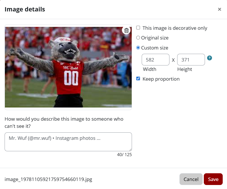
In Moodle: (see screenshot below) Moodle will ask you to mark an image as decorative only, or fill out the “How would you describe this image to someone who cannot see it?” when you upload an image. This description becomes the alt text. If you copy and paste an image directly into the text editor instead of uploading the image, click on the image and then the image icon in the toolbar that appears to open the image properties and add alt text.
The Brickfield Accessibility+ Toolkit provides a wizard that will find images with common alt text issues, including missing alt text, alt text that is a placeholder text like “image,” and alt text that is a file name (e.g. image.jpg). It cannot check the appropriateness of alt text beyond common errors, so it is important to check all images in Moodle manually.
In Microsoft Office products: Right-click on the image and select “View Alt Text” from the menu. Write your alt text in the box on the pane that appears on the right, or check “mark as decorative” if that is appropriate.
Some programs will try to automatically identify and describe your images using AI; it’s a good idea to check all your images manually, as the Microsoft Accessibility Checker cannot check if the alt text is appropriate.
Alt text in quizzes
Approach quiz alt text by asking yourself “what would a student who can’t see this image need to know to be able to answer the questions? What would I hope they will notice or recognize in this image?” It might mean that you gives them a few more clues with in the description, but remember that sighted students would have the benefit of several visual clues. Remember that the only students who will “see” your alt text on quiz images will be those students using screenreaders. Sighted students would need to do quite a bit of work to access those descriptions in a testing environment.
Alt Text tools, examples, and templates
DIAGRAM center:
- The Description templates from DIAGRAM center include guidelines specifically for common types of graphs and visualizations, with example images and alt text.
- See also the Image Sample book from DIAGRAM center
- See also POET by DIAGRAM center for suggestions and recommendations for alt text
- Examples include complex diagrams and are very helpful.
AI Descriptions: The paid versions of ChatGPT and Gemini are both able to recognize and describe images that are uploaded. These descriptions need to be reviewed and may require editing, but provide a good starting point.
Accessible text
About accessible text
Depending on its features, text displayed on a screen may not be fully perceivable if someone has limited or no vision or color-blindness, is in poor lighting conditions, has poor screen resolution, or has a learning difference or is otherwise neurodivergent. Additionally, some people may want to access textual information by having it read to them, which requires the text and its structure to be fully described by text-to-speech software.
Ensure all learners can fully and easily interact with text-based content:
Make sure text is not an image of text.
If text cannot be highlighted and copied/pasted, it is likely an image of text and is not accessible. Pay special attention to PDF’s on this one, as many PDF’s are scans of text. For more information, see the section on accessible PDFs below.
Tables are commonly shared as images rather than text. Recreate a text-based table of the data to replace the image. Learn more in the accessible tables section below.
Choose the color of the text wisely.
Make sure your text color adequately contrasts with its background. Use WebAIM Contrast Checker, Color Contrast Analyzer for Chrome, or Contrast Analyzer for Windows and Mac. On a light background, the text should be at least 4.5 times darker than the background; on a dark background, the text should be at least 4.5 times lighter.
Do not use color alone (either the text or highlighting, etc.) to convey meaning as that meaning will be lost to those with colorblindness or those using screen readers. It’s OK to use color, but convey that meaning or emphasis in another way as well (bold, italics, etc).
Avoid color pairings that are challenging for individuals who are colorblind (red and green, for example). Test graphics for color contrast with Coblis: Color Blind Simulator.
Give hyperlink text a different color from surrounding text. Hyperlink text is usually blue but may be any color that contrasts sufficiently with surrounding colors. Use the same color for all hyperlinks in a given document or web page.
Learn more
- “Accessible Color Use and Color Contrast” from OIT Accessibility.
- University Libraries’ resources for colorblindness
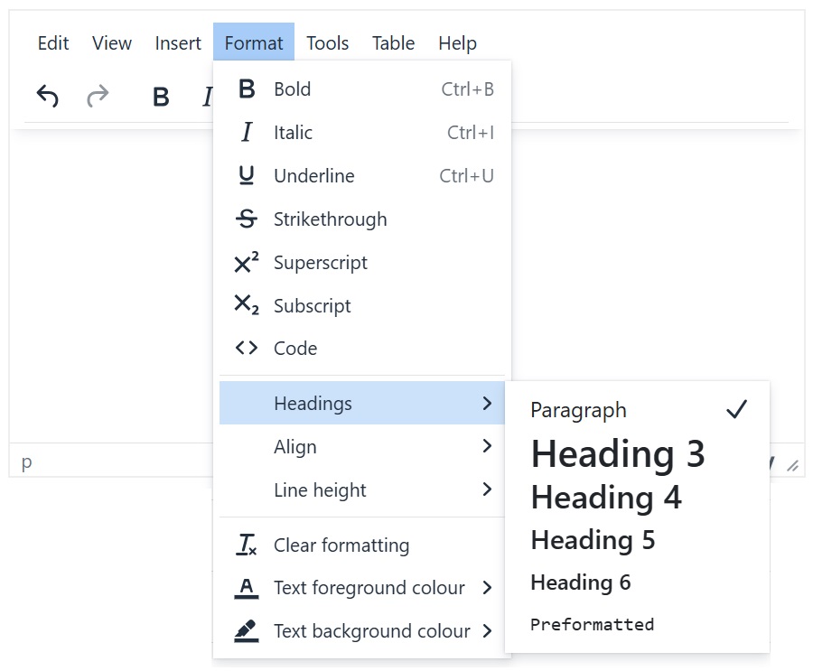
Use heading styles when text has a hierarchical structure.
Screen readers cannot tell that simply formatting changes signify a heading, so you must use heading styles. As a bonus, Microsoft Word and Google Docs use heading styles to automatically generate a document outline, which is useful for anyone.
To apply heading styles in Moodle, click “Format” in the editor toolbar, and find “Headings” in the menu to choose your heading (see screenshot below).
Instructions for headings in Microsoft Word and headings in Google Docs
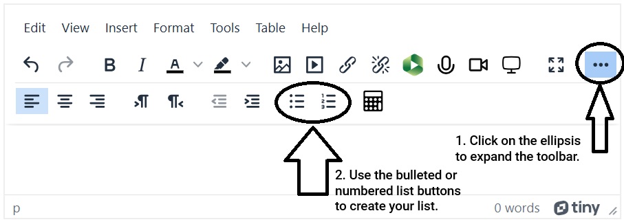
Use built-in list tools when appropriate
Built-in lists help anyone easily understand better the structure of text. To use lists in Moodle, use either the bulleted or number list buttons (see screenshot below).
Instructions for lists in Microsoft Word and lists in Google Docs
Make text easy to read
Use simple, easy-to-read typefaces and limit the number used to no more than 2 in a given document/page. Sans serif typefaces (e.g., Arial, Calibri, Verdana, Roboto) are usually safe choices.
In a document, use text size at least 12; in a presentation to be shown live, use a text size at least 24.
Limit font variations (e.g., bold, italics) and strings of words written in all caps, which is particularly difficult to read.
Reduce eye fatigue by breaking up “walls of text” with white space and increasing the spacing between lines to 1.15 or 1.5.
See WebAIM’s Typefaces and Fonts article for more information.
Minimize distractions
Avoid using text that blinks or moves.
Eliminate distracting grammatical, spelling and syntax errors
Make text easy to understand
Do not using unnecessarily complex language where simpler language will do.
If you use acronyms and jargon, be sure to define them clearly and provide a glossary. Avoid the use of idioms, which are often unique to one culture and do not translate well to other languages.
Don’t underline text that is NOT a hyperlink.
Link text thoughtfully
Link descriptive text instead of a URL. URL’s are mean to be read by web browsers, not screen readers or people. They are meaningless and can be quite tedious to hear if using text-to-speech programs. The only time it is important to include a URL is in material that is likely to be used as a printed resource.
Be concise and precise. Can someone scan the page and quickly determine what is linked and where each link will take them? Link text should be just long enough to make it clear where the link will take someone.
Write out email addresses to make it clear that the link is an email address and not a webpage.
Alert users if a hyperlink downloads a file [for example, “Campus Map (PDF, 5.62 MB)”] or if a hyperlink opens in a new browser tab or window [for example: NC State University Homepage (opens in new tab)].
See How to write meaningful link text from the NC State Libraries for more information.
Ensure Accessible PDFs
PDFs can be a great format for portability, because the reader software is free and platform-agnostic. However, to make them truly accessible, there are a few things you must do when creating your PDF. Note that all of the guidelines for alt text, headers, tables and text formatting) also apply to PDFs. Here, you’ll find issues specific to the PDF format. Learn more at PDF Accessibility from the NC State University Libraries.
Include a link to Adobe Reader
The best practice according to the WCAG standards is to include a link to download Adobe Reader any time you are posting a PDF. Be sure to include a link to download the reader somewhere in your Moodle course.
Ensure accessibility of scanned or otherwise-sourced PDFs
If you have a PDF that is a scanned document or a PDF you downloaded from another source, such as a journal article, you may need to make it accessible without the original source document.
Use Adobe Acrobat Pro. Adobe Acrobat Pro can recognize text, establish a reading order and headers, and create a tagged document. Open the document, click “Edit,” and Adobe Acrobat will use optical character recognition (OCR) to create a text version of the document. For more information, see Create and verify PDF accessibility (Acrobat Pro)
Ask for help from the library. Use the “Chat now” feature from University Libraries to contact someone who can help you find an accessible PDF for journal articles.
Ensure accessibility of PDF’s you create.
You must start with an accessible document in order to convert it to an accessible PDF.
- When converting an accessible Word document to PDF, use the “Save as…” command and choose PDF. Enabling the “Document structure tags” option in Word, or the “Tagged PDF” option in OpenOffice.
- When converting an accessible PowerPoint file to PDF, follow this workflow for converting accessible PowerPoints to PDFs
- When converting an accessible Google file to PDF, you must go through Grackle to create the PDF in order for it to be accessible.
Accessible tables
Data tables are used to indicate the relationship between variables using rows and columns. For example, using a table to list countries alongside their GDPs. Data tables should have header rows and columns identified.
- In Moodle, place your cursor in the header row. Then, select “Table” in the editor menu, then Row > Row properties and choose “Header” as the row type.
- In Microsoft Word, right click on the header row and select “Table Properties.” In the Table Properties dialog box, click the Row tab and check the box that says, “Repeat as header row at the top of each page.” Learn more about the built-in Microsoft Accessibility Checker.
- In Google Docs, select the header row and pin it at the top. See support documentation on editing tables, scrolling down to “Pin header rows in Google.”
- It is not possible to define a header row in Google Slides.
Other important practices are avoiding empty cells and merged cells.
Layout tables are used to arrange images visually. Layout tables are used to control the visual formatting of images and text, rather than to convey relational information. For example, using a table to position six images in two rows of three pictures each. Strategies for accessible tables:
Accessible audio and video
Make images in video accessible
If the transcript and captions of a video do not fully describe what is being shown on screen in the video, descriptive text must be provided for the on-screen visual so everyone can perceive it. For example, if a speaker says, “Watch the animation of this process” but does not describe what is happening on the screen, that instructional content is lost for some users. To learn more about this topic, watch the video “Using Descriptive Language in Videos” (1 min, 55 sec) or read WebAIM’s article “Captions, Transcripts and Audio Descriptions”. You might consider using this Video Long Description Template.
Make audio content universally perceivable
Audio-only content as well as audio within videos must be supplemented with a text-based version of the audio. That way, if a learner has permanent or temporary hearing loss, has a native language other than English, is neurodiverse or has a learning difference or cognitive impairment, needs to be quiet due to their environment or is in a noisy location that makes it hard to hear, they can still fully interact with the content.
Text-based versions of audio content include captions and transcripts.
- General resources
- Watch “Using Transcripts and Captions in Videos” (56 sec)
- Apply for an NC State captioning grant, which will provide funds to have your videos captioned accurately by a third party vendor.
- Video & Audio (article from NC IT Accessibility)
- Tool-specific resources and help documents
Clear organization and navigation
Use clear, consistent naming conventions in Moodle
- Be descriptive, concise and consistent when you name your Moodle course sections. Ensure the title helps learners know what they’ll find within that course section, and that the title doesn’t take up too much space in the course index. Include the dates when you’ll be covering that item in the section title (if applicable), to further help student find where they are in the course.
- Be descriptive, concise and consistent when you name resources and activities. Consider starting each item with an action verb that lets students know what they are expected to do with it. For instance, Read: Watch:, Complete:, Submit:, etc. Use clear, distinct names for items so that when they show up on the Moodle page or in the course index it’s clear what they are.
Organize content for clarity, usability and consistency to reduce overwhelm
- Break up long Moodle pages into separate Moodle pages.
- Limit video length to one topic and <10 minutes in length – it is documented that students often lose focus to stop watching if videos are too long.
- Group content and activities in a way that reflects how you want students to interact with your course and help students find what they need.
- Use blocks on the right side of your Moodle course to further group content that you want students to have quick access to. Learn about blocks in Moodle.
- Learn more in Supporting Neurodiverse Students Through Course Design