Spruce Up Your Moodle
Sometimes instructors and course designers would like to add more visual interest to their Moodle content or amp up the style a bit beyond adding images. This page and the accompanying Moodle Project Space offers some elements that can help you "Spruce Up Your Moodle."
In this article
- Section banners
- Stylized headers
- Call-out blocks
- Stylized tables
- Other elements
- Putting it all together
- Get help
Add banners to each section
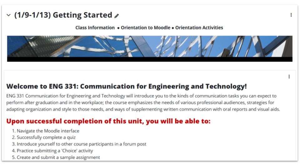
Adding decorative banners at the top of each section of your Moodle course can add visual interest. Above, a photo from Talley Student Union appears at the top of the Getting Started section of ENG 331. (If you like, you may view the full course with banners for each section by enrolling as a student in the project space.)
DELTA has created many banners you might select from (opens in new window) to add to your course.
- Download the images you want to use
- Go to the three-dot-menu to the right of the section title in your course and click “Edit section.”
- Insert the image into the “Summary” box. In most cases, this image can be marked as decorative so that screen readers ignore it.
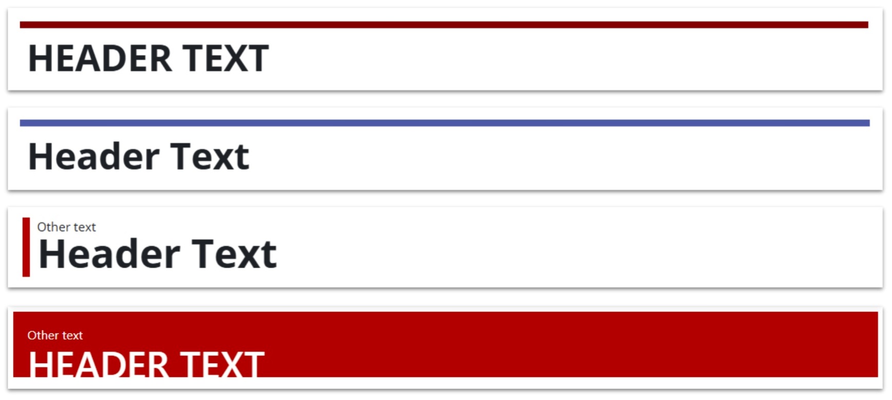
Use stylized headers for pages and more
One way to spruce up a page is to add a more stylized header. You should avoid using too many different styles throughout your course; be consistent and use the same type header for similar types of content. Below are some example screenshots of header styles available on the Moodle Project Space. All except the last one use H3 heading style, the topmost heading style appropriate for a page in Moodle. The last one uses H4 and could be used as a subsection divider if desired.

Use call-out blocks to highlight information
Call out blocks can break up a wall of text and draw attention to a certain portion of text. Below, the top has a simple gray box around the text. The second one has no border, but the box is a light blue color. The third can be used to call out important text: A red border surrounds a gray box, and in the example, the word “Important” is bold and red. Remember, avoid using color as the only way to convey meaning.

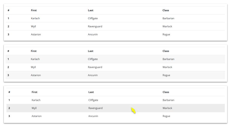
Use stylized table designs
The top table pictured below is quite simple; the second one has every other row shaded gray. The third is dynamic: hovering over a row colors that row light gray.
Add additional elements if appropriate
Example 1 – Basic Accordion

Initially, all that will show on the page is the button (here, it reads “toggle for more details” but the text can be modified). When clicked, a text box opens below to reveal more content.
Example 2 – Basic Card
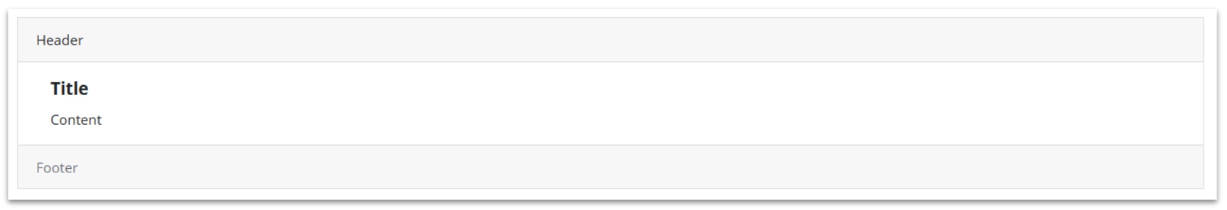
A box around content that includes a shaded header area and footer area with white space for content in the middle.
Example 3 – Side by Side Cards

Two basic cards that include shaded header and footer areas are put in two columns.
Example 4 – Buttons as links

There are three sizes of red buttons with white text (one is the width of the page) and one white button with red text and a red border.
Putting it all together
You can find some example pages in the Moodle Project Space that are available as reusable files. These pages feature multiple stylized elements for the sake of showing how these might appear on a page; it is not necessarily suggested that they all be used together. Be mindful of using these elements intentionally – while they can create great visual appeal, too many can be distracting from the cotnent.
Get help
Need help? Please feel free to request an instructional consultation about this topic.